Dec
2022
What’s that coming over the hill?
DIY Investor
14 December 2022
Is it a monster, or a debt-financing anniversary? Our analysis of the property sector shows chunky discounts across the sector are there for a reason…by Alan Ray
In November we looked at debt, and how the practice of applying a fair value to it can have a significant impact on net asset value. We also looked across the investment trust sector at discounts and tried to shine a light on some of the reasons why they have widened in 2022. This week we are bringing the topics of debt and discounts together and looking at the behaviour of property fund share prices. But first, an anecdote.
In late 2007 we were talking to the finance director of a property fund about gearing. It was, if we are being honest, something of a tick-box exercise until towards the end of the conversation we said: “It would be great if you could share the details of your debt covenants.” There was a pause and then a bit of a chuckle and then the reply: “Why do you want to know that?” Then before we could speak, they replied for us, saying: “Oh, you think that property values might go down, don’t you?” We seem to remember our very eloquent reply was something like: “Well, yeah…” As it turned out, the fund’s gearing was about 75%. And the key covenant on the gearing was that debt was not to exceed 75%, as exceeding that covenant would in theory allow the lender to step in and take control of the assets. So, the fund was geared all the way up against its covenant. This was a deliberate choice – the manager had used every last bit of debt to buy property with no headroom left against the debt covenant.
We tell this anecdote not to name and shame any particular property fund – and in any case, the fund in question was eventually delisted due to excessive debt – but we’ve never forgotten that conversation and were lucky to have had it, as it woke us up to the risks in a timely manner. We just want to paint a picture of how debt was viewed prior to the financial crisis. It was seen as just another tool, and if it was cheaper to borrow than to issue shares, then why not? Investment trusts, including property funds, were being actively encouraged to use more debt.
More recently, this got us thinking: Does experience from back then colour the way that property funds today manage their balance sheets? And could there be a correlation between that and discounts? We wanted to see whether property funds that lived through the financial crisis are behaving differently to those that came after.
Our anonymous finance director above was far from being alone in 2007. Almost no one disclosed what their debt covenants were, but this soon changed as there was quite a coordinated effort by analysts and investors to get these important metrics out into the open. As we all know, stock markets prefer transparency to opacity. So, we started looking at disclosure across property funds today, to see whether there was a tailing off in transparency the further away from the financial crisis we get.
The chart below shows what we came up with. Superficially it might look a bit complicated, but fundamentally it’s making quite a simple point and below the chart we explain what it shows.
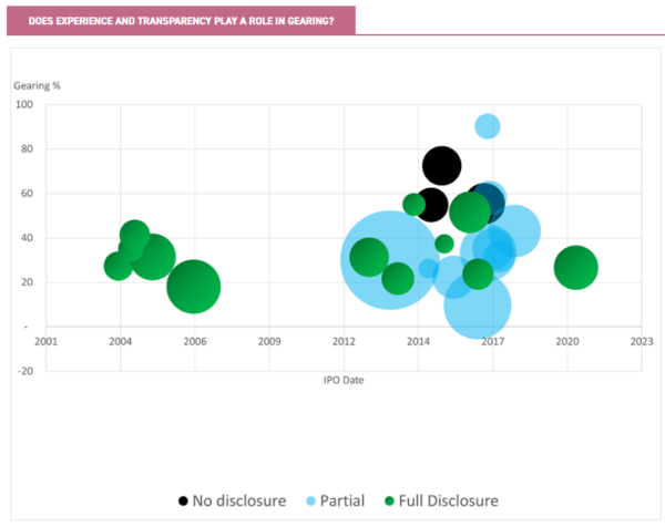
The x-axis shows time, with each property fund plotted against the date of its IPO. This very clearly shows that there was a flurry of property IPOs in the years leading up to the financial crisis, and then a long hiatus. It seems it took several years before the market was ready to embrace new property fund launches.
The y-axis shows gearing gross to net, and the higher the bubble is, the more geared the fund is. The size of each bubble then represents the total assets of each fund, thus reflecting the scale of any problems.
And finally, there are three different colours of bubble to illustrate each fund’s transparency in disclosing its debt covenants, in order to test the idea that experience of a previous crisis will in some way shape behaviour towards better preparing for the next. There are three different categories of disclosure: full disclosure, where the debt covenants are in the fund’s report and accounts in full, along with an analysis of headroom; partial disclosure, where some analysis is provided and it might be possible for us to reverse-engineer the covenants; and no disclosure, where there is only passing reference made to covenants but no actual analysis.
We were very excited to see that the chart does indeed show that property funds that lived through the financial crisis are: a) all fully transparent, and b) a bit less geared than the average. It seemed like we were onto something. Therefore, next we chose to relate the size of the bubbles to the funds’ discounts, so that the bigger the bubble, the bigger the discount.
This is shown in the next chart, although all the other elements of the chart are the same as in the previous one.
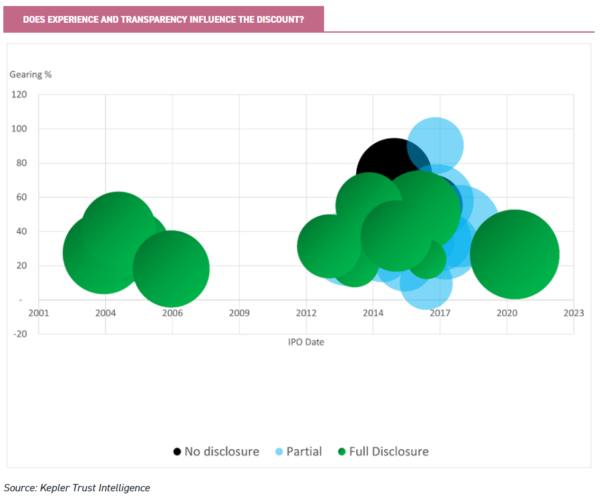
Given we were looking for confirmation of our initial hypothesis, these results couldn’t have been more disappointing as there really isn’t any pattern at all. Yes, there are some discounts that are obviously larger or smaller than the average, but if we drill down, all of these have a specific fund-related explanation. The point of this piece isn’t to get into individual property funds, so we won’t go over those. We think it’s fair to say that in general discounts are quite wide and there isn’t a strong correlation to the level of gearing. This is very different to discounts in 2008 and 2009, where there was a very strong correlation between a fund’s gearing and its discount.
So, then we thought: We’re looking at this expecting history to repeat itself. But what if it’s just rhyming? Like many clichés, this one is a cliché for a good reason, so next we asked ourselves: What’s different? Back then, the big problem was that everyone had become comfortable with very large amounts of debt. As Chart 1 shows, the market has kept this memory and newer property funds might be using a bit more gearing, but in general a lid has been kept on this. But what about the cost of debt? It has been so cheap for so long that everyone has just stopped thinking about it.
We’ll get to what we came up with next after a word about debt and debt ratios, which we think is important. To be consistent, Kepler always uses the investment trust-style measure of gearing, which is to say the ratio of gross assets to net assets.
To give a simple example, if we say something is 50% geared, what we mean is that for every £1 of net assets, there is another £0.50 of debt. But in the property world gearing is calculated using the loan-to-value (LTV) method, where the value of the debt is divided by the total value. So, what does 50% gearing mean in LTV terms? It means that for every £1 of net assets, there’s another £1 of debt. In the anecdote at the start of this piece we referred to the fund being 75% geared, but in fact we were using LTV in that calculation.
What does 75% LTV mean? It means that for every £1 of net assets there is £3 of debt. Put another way, 75% of the overall value is debt. That’s a really big difference to 75% gearing in Kepler’s preferred terminology, which would imply £0.75 of debt.
Many of our readers will know this of course, but we think it’s so important to understand this that we hope those that already do will forgive us for spelling it out. If you are ever doing primary research and reading the accounts of a property fund, just remember that references to gearing will almost certainly be figures calculated using the LTV calculation. Just to hammer this all the way home, here’s a little table showing the difference.
For every £1 of net assets, how much debt is there?
| GROSS TO NET (THE KEPLER METHOD) | LTV (THE PROPERTY METHOD) | |
| 10% | £0.10 | £0.11 |
| 20% | £0.20 | £0.25 |
| 30% | £0.30 | £0.43 |
| 50% | £0.50 | £1.00 |
| 75% | £0.75 | £3.00 |
Source: Kepler Trust Intelligence
Anyway, back to the story. We thought: If the market is worried about the rising cost of debt, then surely discounts will have a correlation to that? What we didn’t do is a complex analysis of weighted average debt maturity or look at the current cost of debt against predicted future costs, as although complex analysis is sometimes necessary and interesting, at times simple truths can get lost in that complexity. So instead, we just looked at when the next refinancing event for each property fund would be.
The chart below still shows time on the x-axis, but now represents the date at which each fund is expected to have some form of refinancing event. We’ll draw this out a little in the next paragraph, which is mercifully the last paragraph, but looking at this chart, we thought: So there it is. Every fund bar one has a refinancing event due in the next few years. The market sees that and that’s why they are all, more or less, on the same discount.
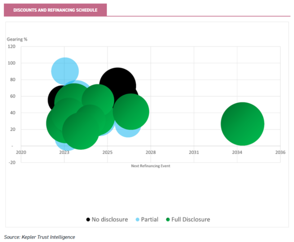
Before we land on that promised last paragraph, we should say that the point of this piece isn’t really to focus on individual funds as we are thinking about the macro issues here. So, we won’t identify the outlier on this chart with the long-dated debt. We are satisfied, however, that there is a very specific explanation as to why this fund is trading at a large discount not related to debt, and so it doesn’t change our conclusion. We should also just mention, though, that in the midst of putting together this analysis we were lucky to spend an hour talking to Marcus Phayre-Mudge, the manager of TR Property (TRY), and he very helpfully shared his views on the topic. TRY isn’t one of the funds in the above analysis as it principally invests in property securities, and the above views are our own. And of course, Marcus and his team are the specialists who are very adept at navigating issues such as the one we’ve presented here. For some TRY may well be the answer, and we will publish a note on it very shortly.
In conclusion, discounts on property funds are there in good measure because the market knows that the cost of debt has risen and may rise further. Property as an asset class is geared, and so a rise in the cost of debt must inevitably lead to a repricing of property. That’s what discounts are telling us, and in that sense, they are perfectly rational. The property funds in our sample aren’t by any means looking at a cliff edge of refinancing, some have multiple lines of debt, with longer maturities, most are quite modestly geared by historical standards. The market will start to discriminate between these factors in due course and in our view the same analysis in 12 months’ time will show a very different pattern. But almost all will see some part of their debt structure rise in cost in the next two years, and this will be repeated across property as an asset class – our sample is just a microcosm. But, as the title of this piece implies, nobody saw it coming.

Disclaimer
This is not substantive investment research or a research recommendation, as it does not constitute substantive research or analysis. This material should be considered as general market commentary.
Alternative investments Commentary » Brokers Latest » Commentary » Investment trusts Commentary » Investment trusts Latest » Latest » Mutual funds Commentary
Leave a Reply
You must be logged in to post a comment.