Nov
2023
What is a Santa Claus Rally, and what does it mean for investors?
DIY Investor
21 November 2023
A Santa Claus rally typically happens at the end of the year. It describes a jump in the stock market in the week leading into Christmas and the first few trading days of the new year – by Russell Shor of FXCM
Various theories have been suggested for the phenomena including tax considerations to investors using holiday bonuses to buy shares to a general feeling of optimism.
Generally, the week after 25 December is quiet with shares trading in a narrow range. This is due to market participants enjoying the break between Christmas and New Year. The Santa Claus rally was first noted by Yale Hirsch in the 1972 Stock Trader’s Almanac.
The truth is that there is contradictory evidence of the validity of a regularly occurring Santa Claus effect. According to the 2019 Stock Trader’s Almanac, the market increase from 1950 to 2019 was an average of 1.3% during the Santa Claus rally period. However, from 2010 to 2020, this was noticeably lower, with an average of 0.4%, and other periods also showed a decline. For example, the period from 2014 into 2015 showed a decline of 3%, and 2015 to 2016 saw a drop of 2.3%.
Whilst it does make for an interesting and pleasant anecdote, the Santa Claus rally is by no means guaranteed. In effect, there is an inherent risk in relying solely on a seasonal anomaly or calendar event, such as the Santa Claus effect, to base investment decisions.
Nevertheless, there may be some indications that the stock market is setting itself up for a rally into year-end.
NAS100 vs SPX500 Relative Strength
There has been a general phenomenon since the lockdown of 2020 that when the Nasdaq (NAS100) outperforms the S&P 500 (SPX500), the broader S&P 500 (SPX500) tends to appreciate. This suggests that the technology-based growth index is a key driver of growth and stock market performance. Consider chart 1.
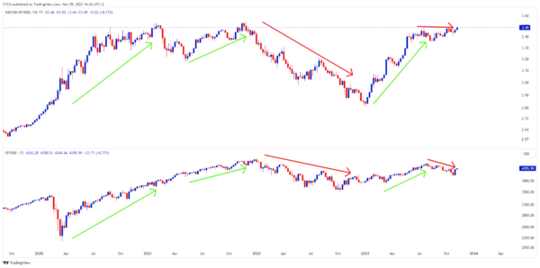
Source: www.tradingview.com
Chart 1
The top pane of chart 1 shows NAS100 divided by SPX500 i.e., NAS100 is a numerator and SPX500 is a denominator. The green arrows indicate periods when the NAS100 (numerator) is performing better than the SPX500 (denominator). The red arrows show the underperformance of NAS100, compared to the SPX 500’s sideways (and steady) performance.
The bottom pane of chart 1 shows the broader SPX500. Generally, it tended to appreciate when NAS100 was outperforming the SPX500 (green arrows). Underperformance or steady performance is linked to the depreciation of the broader SPX500 index (red arrows).
Current Relative Strength Analysis
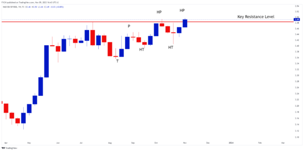
Source: www.tradingview.com
Chart 2
Chart 2 shows a close-up of the relative strength chart (RS), where NAS100 is the numerator and SPX500 is the denominator. The RS has charted a series of higher troughs followed by higher peaks, since the August bottom.
This suggests that the NAS100 is outperforming the SPX500. Importantly the RS ratio is now challenging the key resistance level of 3.48 (red horizontal line). If it can close above this level, it will bode well for the broader stock market based on the relative strength analysis of chart 1.
Current SPX500 Analysis
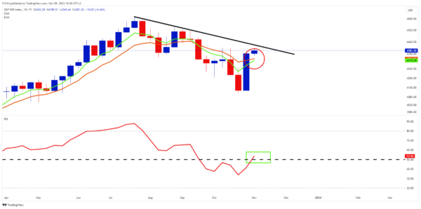
Source: www.tradingview.com
Chart 3
Now that the RS chart is showing some signs of positivity, it may ripple down into a stronger SPX500. Chart 3 shows the SPX500 index – last week the index jumped by over 5.8%, which was a strong and positive move. Already the RSI indicator, which is momentum-based, has moved to the bullish side of 50 (green rectangle). If it can maintain on this side, there will be an underlying positive momentum driving the broader market.
Three technical developments will go a long way in supporting a stronger SPX500 scenario. Firstly, the green five-week exponential moving average needs to cross above the orange ten-week exponential moving average (red circle). This will put the EMAs into a bullish formation.
Then, the SPX500 needs to cross above the black downward-sloping trendline, which may be acting as a price resistance. Thirdly, because EMAs are trend-following indicators, they need to develop an angle and separation to the upside, which will suggest that the SPX500 has started trending upwards.
Conclusion
The Santa Claus effect was observed as early as 1972. However, pricing data over the years suggests that it is an unreliable phenomenon. Nevertheless, there is a stock market relationship which potentially suggests a rally into the end of 2023. The relative strength between the NAS100 and SPX500 tends to come into effect when the broader market is due to appreciate.
As such, the NAS100 has started to outperform. If it can break out above its key resistance, this may ripple through to the stock market and see the broader SPX500 appreciate. Just in time for Christmas.
Leave a Reply
You must be logged in to post a comment.