May
2020
Sell in May? Stock Market seasonality effects and anomalies
DIY Investor
19 May 2020
Stephen Eckett’s fascinating reference work delivers an update on the strongest – and strangest – seasonality effect in the market
This month we delve further into this engaging and curious guide to the financial year and consider vital information for all investors and traders looking for the little edge that could make a big difference.
Sell in May
An update on the strongest – and strangest – seasonality effect in the market.
It’s that time of the year again when stock market lore advises investors to get out of the market and, effectively, go on holiday for six months. And, indeed, Sell in May has been good advice over certain periods, for example since 1970 the average return in May for the FTSE All-Share Index has been -0.4% (making it one of only three months that has a negative return the other two being June and September).
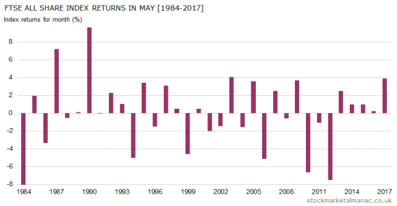
However, in recent years equities have performed somewhat better in May. Since 2000, the market has seen more Mays with positive month returns than negative and, as can be seen in the accompanying chart, in the last five years the market has been up every May (last year, in 2017, the FTSE All-Share Index had a not insignificant month return of 3.9%).
So, why does May have a bad reputation for shares, and why is the saying “sell in May” so popular?
One reason can be seen in the chart. Although the proportion of positive and negative month returns in May are roughly equal, it can be seen that the positive returns in May are relatively low, whereas when the market falls in May it can suffer quite a large sell-off. In May 2012 the FTSE All-Share Index fell 7.5%, which the largest fall in the index in any month in the last six years.
The average May
In an average May the market trades fairly flat for the first two weeks of the month, and then prices drift lower in the second half.
Stocks
At the stock level, in the last ten years the FTSE 350 shares with the best average performance in May have been: Aveva Group [AVV], 3i Group [III], Babcock International Group [BAB], Cranswick [CWK], and Severn Trent [SVT]. All these stocks have only seen a negative return in May in one year since 2007.
While the FTSE 350 shares with the worst record in May have been Petra Diamonds [PDL], Ferrexpo [FXPO], Thomas Cook Group [TCG], Acacia Mining [ACA], and Carillion [CLLN],
Diary
Coming up in May we have the two-day FOMC meeting starting on the 1st, US Nonfarm payroll report on the 4th, May Day bank holiday on the 7th (LSE closed), MPC interest rate announcement on the 10th, Spring bank holiday on the 28th (LSE and NYSE closed), and the quarterly 30th.
When we look at historic time series of asset prices the frequencies we use tend to be day, week, month or year. But new patterns of behaviour might be revealed by using other time frames.
In this case we are going to split the year into two six month periods:
- Winter period – 1st November – 30th April
- Summer period – 1st May – 31st October
The following chart compares the performance from 1982 of the FTSE All-Share index for the next two periods; each bar represents the out performance of the winter period over the following summer period. For example, from 1st November 2013 to 30th April 2014 the index rose 1.0%, while during the following period 1st May 2014 to 31st October 2014 the index fell 3.2%. The difference in performance was therefore 4.2%, and that is the figure plotted on the chart for 2014 (the final bar in the chart).
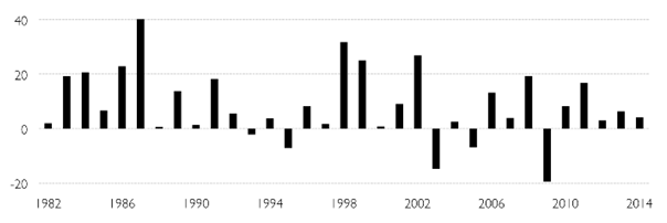
The chart shows quite a remarkable thing, namely that the market seems to perform much better in the six-month winter period than the summer period. To quantify this outperformance:
- In the 33 years since 1982, the winter period has outperformed the summer period 28 times (84%).
- The average annual outperformance since 1982 has been 8.6%!
The behaviour is extraordinary and should not exist in a modern, efficient(ish) market. But exist it does. Indeed, a similar effect also exists in other markets such as the US.
How long has this been operating?
The following chart is identical to that above except that the data starts from 1922.
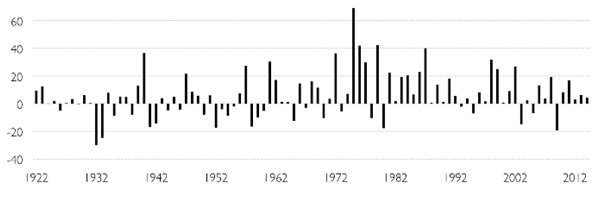
We can see from this chart that in the first half of the 20th century performance in the two periods was quite evenly balanced, but the behaviour changed significantly around the beginning of the 1970s.
It may be that the above study is woefully short term in its approach. An academic paper in 2012 found evidence of the Six-Month Effect (also called the Sell in May Effect in the UK and the Halloween Effect in the US) starting from 1694 in the UK. The paper also found that the effect was present in 36 of 37 developed and emerging markets.
Days of the Month
Last time we looked at the behaviour of the UK stock market in an average month, here we look at the historic behaviour of the market on each day of the month.
The following chart plots the average daily returns for the 31 calendar days in a month for the FTSE 100 over the period 1984-2015. For example, since 1984, the FTSE 100 has on average increased 0.27% on the 1st day of each month.
Note, the chart plots the average returns on the calendar days of the months rather than just trading days.
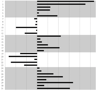
Some observations:
- The first day of each month has the highest average daily return for the FTSE 100, followed closely by the second day.
- The worst average daily return has been on the 20th of the month.
- As can be seen in the chart, the periods of strongest daily returns occur in first and final weeks of the month.
- The pattern of daily returns in months divides into five (rather surprisingly precise) phases:
- Phase 1 (1st – 6th): the index sees positive daily returns
- Phase 2 (7th – 12th): the index sees negative daily returns
- Phase 3 (13th – 18th): the index sees positive daily returns
- Phase 4 (19th – 23rd): the index sees negative daily returns
- Phase 5 (24th – 31st): the index sees negative daily returns
- The chart above highlights the positive daily return phases of a month.
This is a book that may have you scratching your head in search of a rational explanation for what is presented, but one thing is for sure, you’ll return to it again and again as 2016 unfolds.
Leave a Reply
You must be logged in to post a comment.