Apr
2024
Pretty, pretty, pretty good
DIY Investor
22 April 2024
Do investment trusts really protect capital and income against inflation? Let’s take a look…by Alan Ray
Last week saw the finale of a TV show that never quite broke through to the popular consciousness of UK TV viewers yet is one of the longest running and most successful shows in history. Fans of Seinfeld, which finished in 1998, and Curb Your Enthusiasm, its successor, got to enjoy a finale that wrapped up both shows in an arc that began in the summer of 1989, which is an admirably long period of time to maintain such a high-quality comedy. While this writer has occasionally pondered why the UK has never really embraced these dual masterpieces, the conclusion reached is, just like our dear old investment trust sector, maybe it’s OK to be ‘in the know’. There are plenty of TV shows to go around, and plenty of other funds for those not in the know.
Both shows are built on observing and questioning either real or imagined social conventions and the skill of the writers and performers is in the identification of conventions one previously never stopped to think about, but once revealed, cause an itch that is impossible not to scratch.
With that tenuous link out of the way, one of the most established conventions in investment trusts is that we consider performance first and foremost in net asset value total return terms. As Jerry Seinfeld would say, ‘what’s the deal with that?’ Let’s think about what net asset value total return actually is. One takes the net asset value and every time a dividend is paid, one reinvests that into the net asset value. First of all, this ignores the ‘share price’, which if one was reinvesting dividends in the real world, would be the price one would reinvest at, and second of all, we know that with great reliability any event Kepler hosts with the word ‘income’ in the title always gets a good turnout. This leads us to conclude that not everyone is reinvesting their dividends.
Now, to be clear, net asset value total return is an incredibly useful performance measure, as it is a level playing-field measure of the manager’s achievement combined with any gearing, share buy-backs, issuance etc. So, it is the performance generated by all the parts of an investment trust that are the reason those ‘in the know’ love them. It’s also the standard performance measure for other types of funds where dividends can be reinvested, or accumulated, and thus provides a way to compare investment trusts with other fund options.
Share price total return is, of course, the other measure one can look at, and it is certainly a more real-world measure for those investors that do reinvest their dividends. But what about those that don’t? What is an investor actually getting, and can we easily show whether what they have received has been a success? One of the phrases that keeps popping up in Kepler pieces for extremely good reasons is ‘real returns’. What might an investor in equities for income actually want from such a strategy? Everyone is different of course, but the old saying about ‘living off the interest’ provides us with an idea that equity income investors might have a base case of capital preservation in real terms and income growing a little bit more than real terms. Clearly if one is using equities in this way, a tolerance for some volatility around this scenario is required.
So, to look at this with any degree of fairness, one needs to take a long-term approach and in the following analysis we take 25 years as our time period. This is somewhat arbitrary but it’s certainly a good amount of time for a long-term investor to hold a basket of investment trusts for income, and it covers a host of market-moving events from financial crises to wars through to zero interest-rate fuelled growth and then inflation. This period should then give one a good sense of a buy and hold strategy, which is what we are going to look at.
Let’s start with the example of City of London (CTY), which can fairly be considered a benchmark equity income investment trust, and of course, it holds the top spot on the AIC’s ‘Dividend Heroes’ list, with a 57-year streak of rising dividends. The chart below plots CTY’s share price and dividend growth in nominal terms over 25 years against Consumer Price Index (CPI) inflation. Remember, we aren’t reinvesting dividends, we are considering the share price as the capital value of one’s holding, while the income is being used for whatever purposes the investor sees fit. The two lines show the growth of the share price and the annual dividend, and if one wonders why the dividend line sometimes goes down slightly, this is just due to timing differences between the trust’s financial year and when it pays dividends and our calendar year analysis. CTY really has raised its dividend payment for 57 years. So the chart below shows that the share price has risen more or less in line with the CPI, while the dividend, on the other hand, is c. 186% higher than it was, having grown far in excess of the index’s 86% rise.
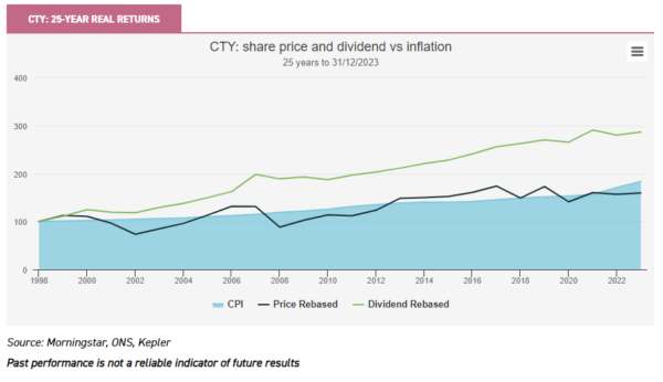
On a technical note, we have chosen to adopt the way the Office of National Statistics shows the CPI index, i.e. everything is rebased to 100. Therefore one can look at the numbers and charts as a way of showing what £100 of shares, say, in 1998 would be worth at the end of the series.
To truly see this in context, one needs to know what the yield at the start of the series was. As we will see later, a low starting yield may be the basis of very strong dividend growth, whereas a very high yield can prove difficult to grow. Somewhere in the middle, where CTY sits, has a good chance of achieving the balance an equity income investor wants to achieve. CTY’s yield at the start of this series, at the end of 1998, was 2.7%. The yield on cost, i.e. the current divided by the original price paid 25 years ago, is 7.9%. For the record, CTY’s current yield if one bought it today is c. 5.0%.
The reason these initial yield and yield on cost numbers are interesting becomes clearer with the next chart. Scottish Mortgage (SMT) of course needs no introduction, but it’s fairly safe to say not many investors these days buy it for income. Nevertheless, it’s quite high on the ‘Dividend Heroes’ table with a 41-year streak.
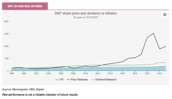
Unsurprisingly the share price rather dominates the chart, but the dividend has grown over 300% (the precise figures are in the table further on). An investor 25 years ago would now have a yield on their cost of 4.9%, although one imagines they’d also be feeling pretty good about the share price, recent ups and downs notwithstanding. This is, of course, an extreme example which demonstrates our point that it is sensible to view a trust with an acceptable yield today as less likely to grow that dividend at a startling rate than a trust with a lower yield, which could have the potential for much higher growth, without having made any particular effort to do so. Over the long haul, high-growth companies may start to pay and grow dividends, and it’s notable how many of the large technology companies which twenty or more years ago would have laughed at the idea of paying a dividend are now doing so. The USD amounts being paid as dividends are vast, but the yields are tiny. But in another 25 years?
Let’s broaden the analysis out a little bit and look at three different ‘buy and hold’ strategies that an investor might have considered 25 years ago. This is relatively unscientific, although in all cases we think it’s fair that ‘popularity’ is a selection factor, since by definition if a trust is popular, it will be part of more investors’ overall experience than an unpopular one. For that reason, we’ve relied on the ‘Dividend Heroes’ for two of our three samples. In each case, we’ve picked four trusts, bought and held them for 25 years, making no adjustments or re-weightings. Just a very simple analysis with the objective of giving one a sense of how an investor might be feeling today about how their wealth has grown, or not, in comparison to the cost of living.
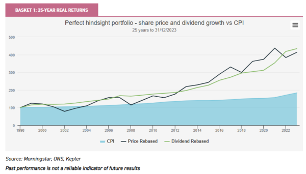
The first chart showing this analysis is below, with ‘Basket 1’, the top four dividend heroes. These are City of London (CTY), Bankers (BNKR), Alliance Trust (ATST) and Global Smaller Companies (GSCT). In fact, Caledonia (CLDN) holds the third spot on the list, but was only adopted in the investment trust structure in 2003, and therefore we’ve excluded it simply because it’s unlikely an investment trust investor would have bought it back in 1999. All of the individual performances are shown in a table further on, but to avoid distraction, let us for now just focus on the fact that this strategy has kept the investor well ahead of inflation in both capital and income terms.
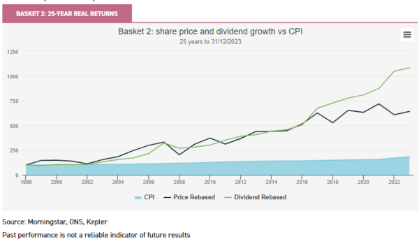
The second basket is simply a list suggested by the rest of the research team, having given them some very basic criteria. The picks are JPMorgan Claverhouse (JCH), Fidelity Special Values (FSV), Mercantile (MRC) and Templeton Emerging Markets (TEM) and while perhaps not a wholly obvious group to pick for income, all of these were certainly popular trusts 25 years ago. It would be very disappointing if one gave a team of investment trust analysts the chance to pick four trusts with the benefit of perfect hindsight and not to have outperformed and indeed this basket has absolutely crushed inflation both in capital and income growth terms. An investor today would have a yield on their initial cost of over 20%. Well done team!
For the third basket we simply picked four more trusts from the ‘Dividend Heroes’, any of which could have caught the eye of an investor in 1999. Thus, we have Scottish Mortgage (SMT), Merchants (MRCH), F&C Investment Trust (FCIT) and Witan (WTAN). In fact, as the table further on shows, we’ve got a mix of low and high initial yields in this group, which respectively out- and under-perform inflation. But the overall result is, again, a real return for both capital and income.
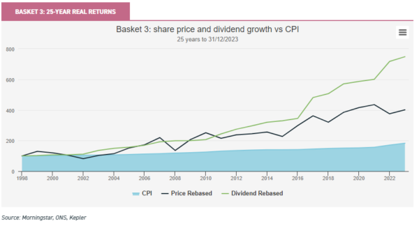
While the point of this exercise isn’t really to highlight individual trust’s performance, we anticipate many will be itching to see the breakdown of who did what over the last quarter of a century. There are perhaps a few surprises in the table below. We’ve discussed SMT already, but the figures are notable. Merchants (MRCH) provided a higher-than-average yield back in 1999 and was constrained in the years that followed by very costly debt, long since expired and no longer an issue. It highlights the importance though of getting decisions about long-term gearing right, and how those decisions can echo down the decades. Mercantile (MRC) investors will be very happy with the outcome. While the yield at the start is slightly flattered by the c. 18% discount it was trading on at the time, it’s an example of where a higher initial yield has actually worked very well indeed.
And of course there are a number of trusts one would not have picked back in the day for their income, but again, it just illustrates that initial versus growing dividend balance that investors need to find.
On another technical note, the CPI figure we show is rebased to 100 at the same start date as everything else. The official CPI data series begins at 100 in 2015, with data provided before then being less than 100, we’ve just rebased it to be 100 at the end of 1998.
Basket constituents: 25-Year share price and dividend growth (to 31/12/2023)
| SHARE PRICE (REBASED TO 100) |
DIVIDEND GROWTH (REBASED TO 100) |
YIELD AT PURCHASE (%) |
YIELD ON COST (%) |
|
| CTY | 159 | 286 | 2.7 | 7.9 |
| BNKR | 400 | 400 | 2.5 | 10.0 |
| ATST | 344 | 484 | 1.6 | 7.8 |
| GSCT | 749 | 565 | 2.1 | 11.7 |
| BASKET 1 | 642 | 434 | 2.2 | 9.3 |
| JCH | 160 | 525 | 1.5 | 8.1 |
| FSV | 1054 | 1204 | 2.8 | 33.2 |
| MRC | 596 | 597 | 3.4 | 20.6 |
| TEM | 756 | 2007 | 1.2 | 24.9 |
| BASKET 2 | `642 | 1083 | 2.2 | 21.7 |
| FCIT | 432 | 448 | 1.5 | 6.6 |
| MRCH | 125 | 169 | 3.8 | 6.4 |
| WTAN | 294 | 371 | 2.0 | 7.5 |
| SMT | 974 | 323 | 1.5 | 4.9 |
| BASKET 3 | 432 | 448 | 2.2 | 6.3 |
| CPI | 183 |
Source: Morningstar, ONS, Kepler
Past performance is not a reliable indicator of future results
Overall then we think this is a good illustration of how a few reliable investment trusts held for the long haul can grow one’s capital and income in real terms. As we noted earlier, ‘real returns’ is a phrase much bandied around these days, but there aren’t many places one can go to test the historical accuracy of any claim to have achieved it.
Conclusion
One of the conclusions of all this is, well you know, that thing we keep talking about. Something to do with eggs and baskets. Diversification matters and as all the examples above show, even a little bit of diversification can help smooth things out, especially as we don’t in real life get to pick the perfect hindsight portfolio.
Second of all, equity income doesn’t have to come from trusts specifically labelled as such. Of course, having such a label puts the onus on the trust to deliver, but adding lower yielding trusts that might grow dividends faster could, in the long haul, pay off.
One just needs to be mindful that higher starting yields today may come at a cost tomorrow, and lower starting yields may pay off eventually, although there are clearly no guarantees.
Last of all, while we noted above that picking 25 years was somewhat arbitrary, that’s not wholly true, as it’s about 25 years ago that investment trusts were confronted by the uncomfortable reality that many of their institutional shareholders had outgrown their ownership of investment trusts and wanted to sell. Boards were, at the time, grappling with a change to the tax rules that opened the door to widespread share buy-backs, wide discounts were quite normal and corporate activity was a seemingly daily occurrence. All of which has quite a contemporary ring to it. But those investors that held their nerve back then did OK, didn’t they?

Disclaimer
This is not substantive investment research or a research recommendation, as it does not constitute substantive research or analysis. This material should be considered as general market commentary.
Leave a Reply
You must be logged in to post a comment.