Aug
2026
Follow the money
DIY Investor
27 August 2026
Fund flows can tell us quite a lot about what’s going on…by Alan Ray
In an era when a curious mind can access information in an instant, it’s a trivial act to find the origins of the phrase ‘follow the money’, and it’s an interesting story if one is minded to look it up. More pertinently, it’s a short and powerful set of words that says so much with such clarity and efficiency. Write them at the top of a blank page, put the coffee on, start typing and there’s a chance one might have a hit TV show or novel before too long.
While the phrase is commonly used in crime fiction and fact, it’s also a very efficient way to describe why we like looking at fund flows. Following the money can tell us a lot about investor sentiment, and knowing what others are doing can be a useful starting point for our own decision-making. In particular, we think it is a great way to examine the question we have been considering in recent articles: is there any evidence of a bubble in the US or elsewhere, or that investors have started to flee in fear of one?
Different people can take different things from the same data though. This analyst’s personal bias is to be more interested in graphs that slope down rather than up, an approach often described as ‘contrarian’. As both a practical example and a spoiler, when we come to the UK graph below, which shows a pattern of outflows, a contrarian investor might start asking whether this creates an opportunity in undervalued UK equities. The same investor might also feel frustration at seeing their home stock market continue its decline in global importance. But those two reactions can exist side by side. It just goes to show why, in investment, it is important to recognise one’s biases and emotions.
Before we get into the data, some context. Our sample covers more than $28 trillion of net assets, using Morningstar’s broad global categories such as ‘US equities’. As such, it tells us about the biggest regions and countries, but not every country in the index. It is a large sample, but it doesn’t include pension funds, sovereign wealth funds or the internal workings of global funds. Our preference is to show fund flows cumulatively, as this tends to show changes in direction better than absolute numbers. And changes in direction are the most interesting points for us as investors to identify.
Let’s start with a prediction. Fund flows can help us interpret other pieces of information, and in a recent article we mentioned something called ‘market narrative analysis’. To briefly recap, the changing frequency of different words in market commentary can tell us a lot, with the classic example being ‘recession’. Many readers are likely doing this analysis without ever having put a name to it. A current example is ‘American exceptionalism’. It is not a new concept, but it has picked up momentum in the last few years. It first appears as a positive, coinciding with the S&P’s inexorable rise, then turns into a discussion about whether the US really is exceptional, and, lately, has gone a bit quiet. One could certainly describe the last six months or so of the US’s interaction with the rest of the world as ‘exceptional’, but whether that’s a good thing or not is a story for another day.
Our prediction is that US fund flows will, therefore, be very strong in the run-up to ‘peak exceptionalism’, before levelling off or even declining and then turning positive again. We might summarise the evolution of the narrative more simply as ‘yes, it’s exceptional’ to ‘hmmm, maybe not so much’ to ‘Geopolitics? What’s that? But wow, have you seen the latest earnings forecasts for the S&P 500?’. The stock market, if we see it as a living thing, can be a very deep thinker sometimes, but equally it can get sidetracked by new information. The same recent article referred to above has a great chart showing how earnings in the S&P 500 are rising and that’s what’s grabbed all the attention.
Well, guess what? Our ‘prediction’ was right. The chart below plots the shorter-term flows into US equity funds, and those three phases can be seen in the shape of the graph. The ‘exceptionalism trade’ causes big inflows, followed by a pause which, as we will see further on, benefits some other stock markets. More recently, the market has noticed those strong earnings forecasts, and participated in some truly exceptional IPOs, including SpaceX, along the way.

Source: Morningstar
One might naturally be thinking ‘well of course US equity fund flows have resumed their upward trajectory. This is the world’s number one stock market and it’s inexorable, right?’. Below is the chart showing flows into US and Global Emerging Market equity funds since 2008. Isn’t that interesting? One of the great things fund flow data can help us do is check our perceptions against reality. Yes, the US is, by a comfortable margin, the world’s most important stock market, and it can back this claim up with long-term performance. But this hasn’t always been matched by the exceptional fund flows of the last few years.
Regular readers have probably already noticed that several of our recent articles have the word ‘bubble’ in them and, while we don’t plan to recap those here, the chart below is a useful piece of supporting evidence. It’s why we like the differentiating characteristics of US equity trusts like JPMorgan American (JAM), The North American Income Trust (NAIT) and BlackRock American Income (BRAI). By contrast, global emerging markets have seen a steady rise in interest over many years, but perhaps in the last few years investors have become distracted by that all-pervasive US market. Just looking at this chart might prompt a contrarian investor to take another look at emerging markets. Fidelity Emerging Markets (FEML) has a strong track record built largely on the back of stock picking. Its flexible mandate gives the manager additional tools, such as the ability to short certain stocks, which has made a positive contribution to that record.

Source: Morningstar
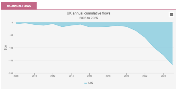
Next let’s look at the UK’s long-term flow data. Again, bear in mind that this is a subset of all money invested in UK equities and that the UK has seen a lot of M&A in recent years, so the true picture is not simply one of investors pulling money out of the market. Nevertheless, this is both a sad sight and, for a contrarian, a tremendously interesting one. Fidelity Special Values (FSV) has a very long history of identifying undervalued companies across the market cap spectrum. If huge inflows of capital can cause mispricing and overvaluation, it is reasonable to assume that outflows can cause the opposite. These are the kind of market conditions in which a trust such as FSV can thrive. Small-cap value specialist Aberforth Smaller Companies (ASL) is another UK trust that tends to thrive when valuations are low and M&A activity is in the air.
Source: Morningstar
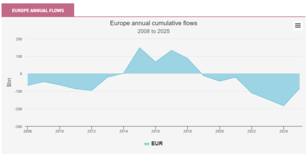
Coming to Europe, we have a chart that a contrarian might question. European equities have had a very good run in recent years, and the pause in flows into the US noted above coincides with flows into Europe. We think this confirms the general narrative that investors were seeking diversification from the US equity market. Since early 2025, Europe has seen strong positive flows, but the contrarian can’t help but notice that these have tailed off very recently.

Source: Morningstar
Fund flows can only go so far in answering that kind of question, but one thing we can do is zoom out to a longer period. Here’s the data for Europe from 2008 to 2025, which shows how indifferent investors have been to Europe for since 2018. So yes, Europe has gained some momentum from inflows in the last year and a half which has seen the market do well, but this comes after a long period when investor sentiment was at a low ebb and valuations were exceptionally low compared with the US. With a strong market run, and those impressive figures coming out of the US noted above, it’s not surprising that there’s been a little pause in market performance recently. Digging a little deeper, Europe’s good performance has been quite selective, with the banking sector a notably strong performer. This has caused a wide dispersion in the performance of active funds. It’s also left a lot of very interesting companies at interesting valuations, so the positive story for European equities likely isn’t over. The team managing JPMorgan European Growth and Income (JEGI) proved to be particularly adept at navigating markets recently, picking up the momentum in the banks very early on, for example, and is an ideal core holding. The European Smaller Companies Trust (ESCT) brings investors into contact with a whole host of interesting, idiosyncratic European companies that could do very well if European equities continue their rise and attract further inflows.
Source: Morningstar
Whereas our earlier ‘prediction’ went quite well, the next chart was not at all what we expected. Here we show long-term flows into Japan. This is a market that has performed extremely well in recent years, yet a long period of steady inflows has now levelled off. Japan is, finally, delivering on the long-promised reforms to corporate Japan that are improving shareholder value, with trusts such as Schroder Japan Trust (SJG) capitalising on this with excellent performance. In local terms, Japan’s Topix is well ahead of the S&P 500 over the last five years. But the fund flows appear to say that investors had, mostly, arrived before that performance was delivered and, despite a very positive backdrop even now, are not chasing the market higher by throwing more money at it.

Source: Morningstar
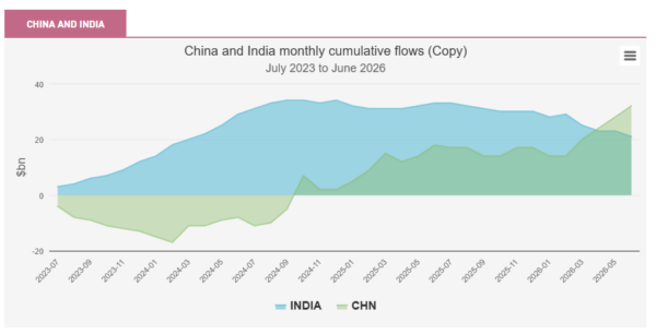
As noted, our dataset can’t tell us about every last country in the index, but India and China are both large economies with many dedicated equity funds, so it’s worth looking at the data here. What’s interesting is that while China’s market has had some difficult times, and perhaps even fallen slightly down the priority list for investors, there are signs in this data that investors are looking for the light at the end of the tunnel. Fidelity China Special Situations (FCSS) is a great way to play this market, with a broad mandate that even encompasses a small number of private companies, which have historically made a significant contribution to performance. India, on the other hand, is a country where investor concerns are concentrated around the impact that AI will have on its large services industry. Some share prices have been hit hard by this, so it feels like this country, which has a lot more to offer than the IT services businesses that investors are worried about, is worth keeping a close eye on. Ashoka India Equity (AIE), with its exposure to smaller companies, could be a great way to play India when the narrative starts to shift.
Source: Morningstar
Conclusion
Fund flows only go so far of course, but the data above suggests that, yes, investors should be increasingly wary of the US, whether this qualifies as a ‘bubble’ or not. That said, the investment trusts operating in this market all have strategies that can help navigate around the pain point of very high valuations. On the other hand, the data paints a very different picture for the UK and the low valuations on offer here continue to be highlighted by investors. Europe has had a strong run of market performance, and this has latterly been accompanied by positive flows. But this is against a backdrop of long-term indifference from investors and we don’t think the pattern of flows suggests a bubble is forming. Similarly, Japan has experienced strong inflows, and investors have been rewarded. But while enormous progress has been made in Japan’s reforms to improve shareholder value, the project has not been completed and investors appear happy to allow this to play out. And both India and China are at interesting points where it’s worth keeping a close eye. Expectations for Indian equities are on the floor, and China looks like it is in the early stages of improving investor sentiment.
Readers can look at this piece as a companion to the article ‘Picks, Shovels and Bubbles’, also written in August. What links them is that, yes, we are presenting opinion and analysis that makes use of quite a lot of data, but both pieces contain ideas that can be used even without access to huge datasets. Putting a name to ‘market narrative analysis’ is a good start. It reminds us that we probably already have quite a bit of qualitative data in our heads that we can use. And even if one can’t access a $28 trillion set of sample data, remember that interpreting fund flows is as much qualitative as it is quantitative. Simply looking at those lists of ‘most popular shares’ that many platforms publish regularly can help us ask questions. That’s not a replacement for a good active fund manager doing the most important work of analysing companies. It’s not always right to go against the crowd, or to be contrary for its own sake. But it can be a very good idea to know where the crowd is heading and to avoid getting aimlessly swept along.

Disclaimer
This is not substantive investment research or a research recommendation, as it does not constitute substantive research or analysis. This material should be considered as general market commentary.
Brokers Commentary » Commentary » Investment trusts Latest » Latest » Take control of your finances commentary
Leave a Reply
You must be logged in to post a comment.