Jun
2023
Diversity matters
DIY Investor
1 June 2023
We examine the effect of blending multiple funds within your regional allocation and find that – while the culture wars may rumble on elsewhere – the benefits of diverity are unarguable…by Thomas McMahon
We think it would be fair to describe the last five years in markets as a little bit rocky. It’s not just the moments of sheer panic – such as when the likely impact of the first wave of the pandemic became clear, or such as when Russia invaded Ukraine – although we have seen plenty of those. It’s also the extreme rotations in style and sector performance, which have resulted from volatile and unpredictable macro and political developments. Truly, you would have needed a crystal ball to anticipate the twists and turns of events and allocate to the right strategies at the right times. The only other way to have done well over the past five years would have been to be diversified.
Last year, we introduced our KTI Spider charts. These are intended to map out the investment trust sector using some key characteristics to position trusts against one another, one of those being diversification. In theory, picking investments with low correlation to one another should improve risk-adjusted returns. We decided to consider how this is borne out in the data and what additional insights could be gained.
Methodological aside
As a brief recap (see the details here), we have placed investment trusts into 13 super-sectors, combining AIC sectors where appropriate. We have then chosen a key benchmark for each super-sector, which has helped us calculate some useful performance metrics. The rationale is that most investors think up a rough asset allocation and then pick funds to fit each bucket (at least that is how the professionals are taught to do it). As such it makes sense from an investors’ point of view to compare, for example, all global equity trusts, whether generalist, sector or thematic, against a basic global equity index. This is a different way to look at performance than poring over attribution against the benchmark the manager has selected, which is more appropriate when trying to assess manager skill. It’s worth bearing this in mind when we discuss trusts, as a trust might look different versus the peer group and benchmarks we have selected versus their official ones. On a similar theme, all our scores express how a trust has done versus the peer group rather than in absolute terms. That is, a trust scoring nine for risk would score in the tenth percentile in the super-sector, (meaning it had relatively low volatility for example), and a trust scoring eight would be in the twentieth percentile of the scores. We need to be careful about over-interpreting results then: if all trusts in a sector are very volatile, big differences in risk scores could represent small differences in volatility. Again, our aim is to build a picture of where trusts stand against each other, rather than present managers with awards for performance, risk or anything else.
Diversification scores
One of the metrics we are tracking is diversification. With our professional investor’s hat on, we have tried to think about what it would be most useful to have diversification to. One element in our score comes from the correlation to the sector benchmark. For example, UK funds will score higher for diversification if they are less correlated to the FTSE All-Share Index. As most investors will have a globally-diversified portfolio, we also think low correlation to the MSCI ACWI Index should result in a higher score for diversification. Finally, as most investors use bonds to diversify their equity-loaded portfolios, we think a trust which is less correlated to bonds should score higher for diversification, too. We have weighted these three correlations equally and normalised the scores to our super-sector peer groups, with lower correlation compared to the peer group resulting in higher scores.
Low correlation can be an attractive feature, but it needs to be considered alongside other characteristics. For example, an asset which lost one percent every single day would display a very low correlation to equity markets, but might not appeal to every investor. Similarly, a relatively high correlation to a trust’s market is compatible with a track record of adding alpha, and this is particularly true of our diversification scores, which include correlation to global equity and bond indices. However, diversification is an important piece of information which can be very useful when considering how to select investments. Below, we highlight some interesting results thrown up by our spider charts. In particular, we note that by combining a trust with a relatively high score for diversification in its super-sector, and one with a relatively low score, steady and attractive returns have been achieved over the long run. It is particularly interesting to consider how this has worked over the past five years, which have seen extreme volatility in markets which would have seen any single-factor portfolio being crushed at one time or another.
North America: JAM / MCT
Middlefield Canadian Income (MCT) has the highest score for diversification in our North American sector, while JPMorgan American (JAM) has the lowest. Below, we show how the spider charts for the two trusts compare.
KTI SPIDER CHART
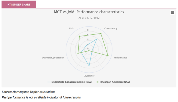
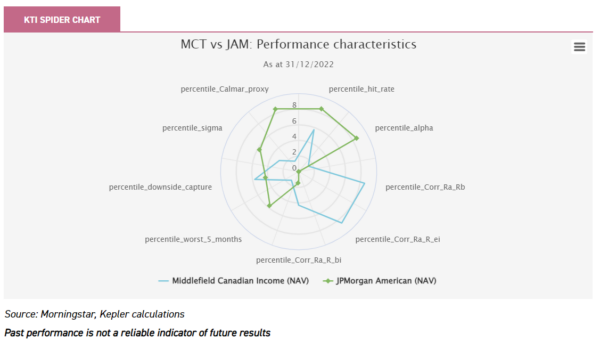
The chart below gives a more detailed view, showing how the trusts score on the underlying components of the different categories. Notably, MCT scores very highly for diversification versus the S&P 500 Index (Corr_Ra_Rb) and global equities (Corr_Ra_ei), but not against bonds (Corr_Ra_Rbi). Another nuance is that while the score for Downside protection, shown above, is lower than average, in the chart below we can see that the downside capture was roughly average over the whole period, while the trust performed poorly in the worst five months for the S&P 500 Index. This has to be considered alongside the good scores for diversification. JAM scored very well for alpha and for consistency (the hit rate). While its scores for downside performance and risk weren’t high, the Calmar ratio was good – this means that the greatest loss wasn’t so high as a proportion of the average return. A key point is that for diversification the trust has scored very low across the board.
This is how splitting your US allocation between the two trusts would have performed. The S&P 500 Index had a bit of a recovery in the fourth quarter of 2022, but investors would have outperformed it with a blend of the two trusts.
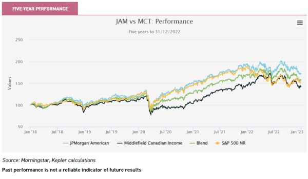
It’s easy to say that JAM has performed better, so picking JAM would have been the right call. That may be true in hindsight, but is pretty useless when thinking about what to do now. We note a five-year period is just a snapshot and the picture might look very different if the starting point was moved a couple of months. Additionally, most of us invest a bit at a time and reallocate funds, rather than buying once and forgetting about things. As such, building a portfolio with a variety of active strategies, designed to deliver different return profiles, seems a good strategy to us. It is easier to see in the chart below, showing rolling one-year returns, that MCT has done better than JAM over the past couple of years. This means that any funds invested in the blended portfolio would have been ahead of JAM over this period, as well as the S&P 500 Index.
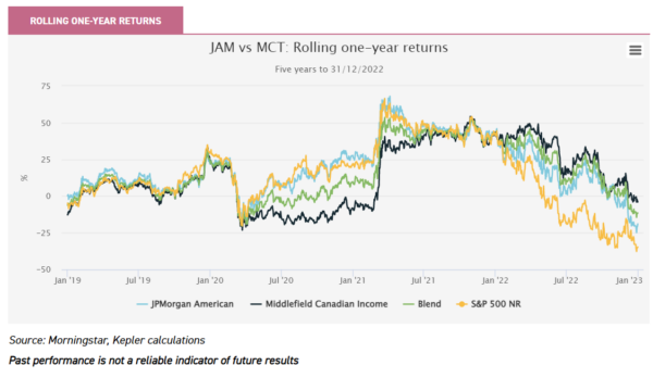
A benefit of investing in two very different strategies is that diversification should reduce the volatility in a portfolio. Over the five years we are considering, JAM displayed annualised volatility of 18% and MCT 20%, but we calculate that the blended portfolio would have had a volatility of just 14.8%. We think this comparison highlights a few interesting points: JAM shows that it is not necessary to have a low correlation to the market in order to outperform (see our latest note for details on its strategy); the volatility in markets over the past five years could have been successfully navigated without predicting the shift from growth to value after the pandemic; picking diversified active strategies can improve risk-adjusted returns.
Global: BWRM / ATST
Pretty attractive returns could have been achieved in a global equity allocation by following the same approach of picking a benchmark-aware strategy and a highly-differentiated trust. Alliance Trust (ATST) has a subtle strategy, which tries to match the benchmark MSCI ACWI Index’s country and sector allocations while allocating to highly active managers who are tasked with selecting only their highest conviction stocks. The intention is for this to allow stock-picking to drive returns rather than style or macro allocations. It has been a tough five years for this strategy given the violent style rotations we have seen, but it has borne fruit at times, and certainly in recent months as with the decline in the FAANG complex (see our recent write-up of ATST’s latest results, which highlights the strong performance ATST has delivered in 2023 too). Five-year performance is shown below. Again, we stress that this is an arbitrary starting point and what is perhaps more interesting is considering the slope of the lines and how different measures have outperformed at different times. We have compared ATST to BlackRock World Mining (BRWM), which, as a global sector fund, falls within our expanded global super-sector. Congratulations to anyone who timed their entry into BRWM and gained all the outperformance since the end of Covid restrictions. Most people, we suggest, didn’t, and even fewer would have foreseen the excellent run mining has seen if investing a lump sum five years ago.
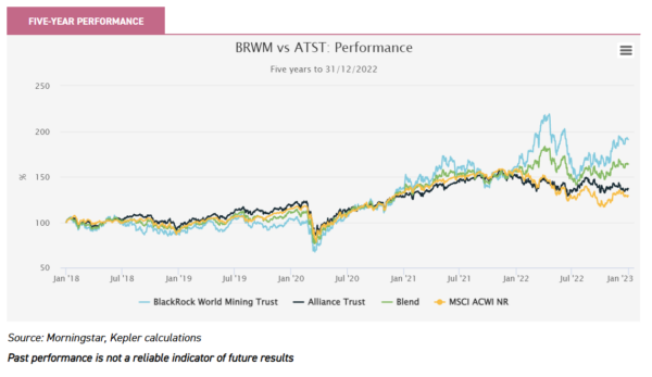
The chart below shows how the two trusts have scored on the inputs to our KTI Spider Chart. ATST doesn’t score highly for alpha despite outperforming over the period as a whole. This is because we consider one-year rolling returns for alpha, and also because the trust’s benchmark-aware approach results in a beta of close to one. The contrast in the scores for correlation between the two trusts is stark.
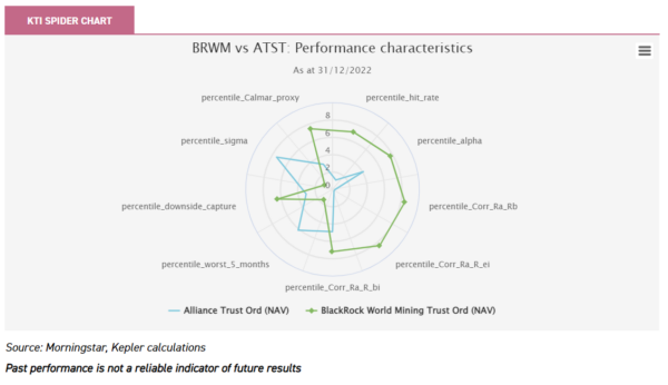
The chart above also makes clear how volatile BRWM has been, compared to the average globally-focussed trust. In fact, it has been the most volatile in the super-sector. This doesn’t matter if you can time your entry and exit perfectly, but if you are not a seer or if you are just someone with a low tolerance for risk, it is a negative to be weighed up. BRWM’s volatility over the period was 25% and ATST’s 15%. We calculate that splitting your allocation 50/50 between BRWM and ATST would have seen the portfolio display a volatility of 16%.
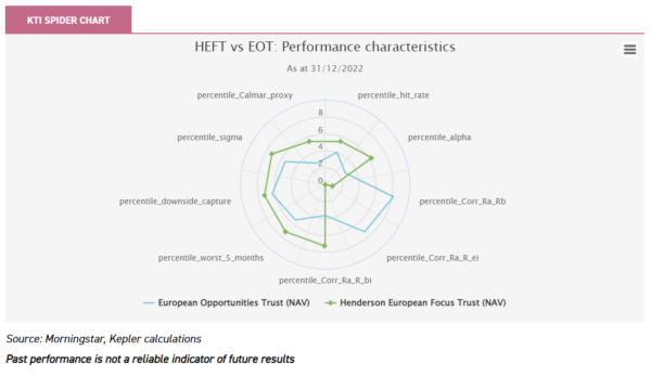
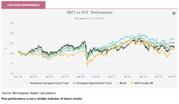
Europe: Henderson European Focus / European Opportunities
Taking a highly-active approach to stock-picking has been linked by academic work to a better chance of long-term outperformance. This makes a lot of sense: to outperform, you need to do something different. However, it also brings extra stock-specific risk, which can lead to underperformance when things go wrong. Over the long run, Alexander Darwall’s highly-active approach has served European Opportunities Trust’s (EOT) shareholders very well. It has also resulted in high scores for diversification in our KTI Spider Chart, particularly against equity indices, as the chart below shows. EOT’s growth style means it has been more correlated to bond indices than average, and more than Henderson European Focus (HEFT), which has a low score for diversification overall.
Looking back over the five years to the end of 2022, EOT was ahead of the index and HEFT until mid-2020, when one of the largest positions and overweights in the portfolio, Wirecard, collapsed. Since then, EOT has had periods of outperformance, but the growth style has largely been out of favour and HEFT has done better. A blended portfolio would have moderated the losses in mid-2020 and moderated, too, the effects of the style rotation in markets since. Overall, it would have performed extremely well over the whole period. We calculate that it would have done so with an annualised volatility of just 12.3%, which is very attractive compared to the 15% of HEFT and 17% of EOT.
UK: Diverse Income Trust / JPMorgan Claverhouse
EOT tends to have a highly concentrated portfolio with significant weights to the largest holdings. Diverse Income Trust (DIVI) tends to be very diversified at the stock level, but nonetheless highly active versus UK indices. This comes across in the high scores for diversification versus equities, seen in the chart below. JPMorgan Claverhouse (JCH), on the other hand, has tended to perform more in line with equity indices and scores lower for diversification.
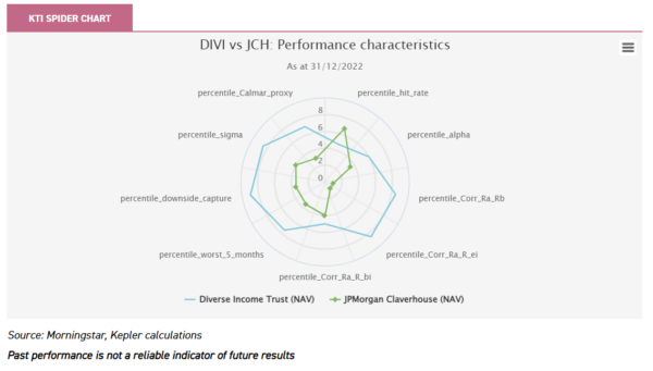
DIVI’s pronounced value bias and concentration in smaller companies has led to periods of strong outperformance and also some recent underperformance. Investing in JCH would have seen a period of outperformance pre-pandemic, underperformance during the rebound and then outperformance more latterly, versus DIVI. The FTSE All-Share Index did perform strongly versus both trusts over the latter half of 2022, which means it is now ahead over five years. However, we note that a blended portfolio of the two trusts has been ahead of the benchmark 58% of the time, over the five-year period.
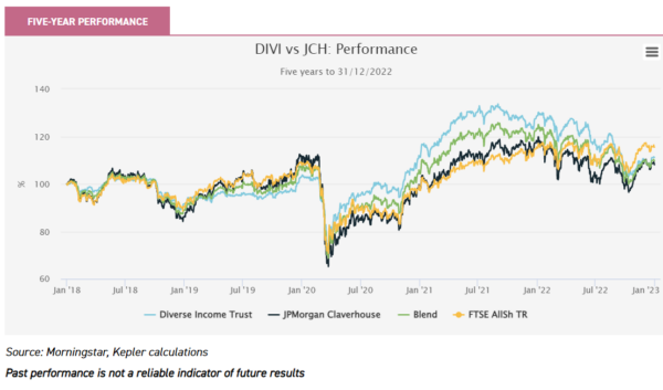
Additionally, a blended portfolio would have displayed significantly lower volatility than the index, as well as both individual trusts. According to our calculations, the volatility would have been 12.3%, compared to 14.4% for the FTSE All-Share Index, 14% for DIVI and 18% for JCHG.
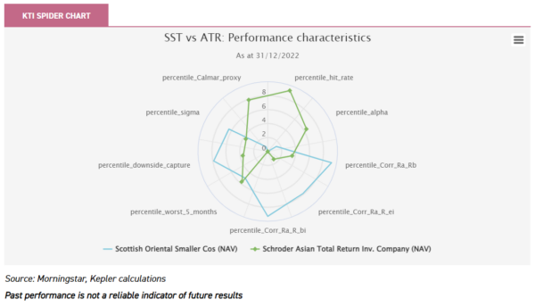
Asia: Schroders Asian Total Return / Scottish Oriental Smaller Companies
One of the highest-scoring trusts for diversification in the Asian sectors is Scottish Oriental Smaller Companies (SST). Over five years, it has low scores for performance and for consistency. This is in contrast to Schroder Asian Total Return (ATR), which has low scores for diversification but high scores for performance and consistency. As an aside, we note that ATR’s high score for the Calmar ratio suggests that the strategy of using options and futures to hedge market risk has helped avoid the worst effects of falling markets.

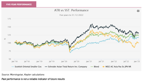
SST has performed very well over the past year or so, outperforming the regional index by 13 percentage points since January 2021. As the performance chart below shows, this has been a period during which ATR has given back some of its high levels of outperformance in recent years. The blended portfolio has, therefore, delivered more consistent returns with a lower volatility: 12.6% versus 15% for ATR and 16% for SST.
Conclusion
We think this discussion speaks to the benefits of diversifying within a regional allocation, rather than either picking one fund or handful of funds which you think are most likely to outperform. In our view, it is more important to make sure that the funds you pick for a given allocation do something different. Inevitably, this will lead to a worse return than if you picked whatever one fund turns out to do best. However, thinking again about what has happened over the past five years, is it really feasible to think you can pick the fund that will do the best in a sector over the next five years? Or to believe you will be able to switch funds whenever trends change? Finally, we stress that just as performance may be different in future, so may correlations. We hope that our KTI Spider Charts give readers ideas for investigation, but note the future is unwritten. Ultimately, changing correlations is another risk investors probably want to diversify against!

Disclaimer
This is not substantive investment research or a research recommendation, as it does not constitute substantive research or analysis. This material should be considered as general market commentary.
Leave a Reply
You must be logged in to post a comment.